

Hi all,
Must be wondering what this is all about.
In conjuction with the current SEO contest 2008, Temi comissioned me to design some award badges for the participants to proudly display on your sites.
Basically, I would design 5 badges. 1 for the Winner, 2nd prize, 3rd prize, 4th prize and the participants. Temi and I decided that you participants should be able to pick the design you would want to display on your sites.
I've done the first set of award badges/shields.
DESIGN 1:
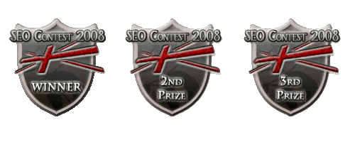

EDIT: DESIGN 2
For this design, I placed everything inside the shield itself, and made the shield bigger. I'll post the Winners badge, the rest would be the same, except it'd say 2nd prize, 3rd prize and so on.

EDIT: DESIGN 3
With just the words sticking out of the shield, the rest of the contents inside.

EDIT: DESIGN 4
For this design, I changed the shield itself to a different shape.

I gave a proud knight-ish feel to it, rather than the usual glossy.
Please give feedback on how you think they can be improved. Is it nice? Don't like it? etc.
Which design do you like most?
There would be more shields to come, I will post it here on this first post, look out for updates. I will post up more shield sets and your feedback for the various sets would be good, so that I can design the final shield according to your needs.
Enjoy.
-------------------------
EDITED: Decided that you guys should vote for which design you're in favor of. So please vote.
Must be wondering what this is all about.
In conjuction with the current SEO contest 2008, Temi comissioned me to design some award badges for the participants to proudly display on your sites.
Basically, I would design 5 badges. 1 for the Winner, 2nd prize, 3rd prize, 4th prize and the participants. Temi and I decided that you participants should be able to pick the design you would want to display on your sites.
I've done the first set of award badges/shields.
DESIGN 1:
EDIT: DESIGN 2
For this design, I placed everything inside the shield itself, and made the shield bigger. I'll post the Winners badge, the rest would be the same, except it'd say 2nd prize, 3rd prize and so on.
EDIT: DESIGN 3
With just the words sticking out of the shield, the rest of the contents inside.
EDIT: DESIGN 4
For this design, I changed the shield itself to a different shape.
I gave a proud knight-ish feel to it, rather than the usual glossy.
Please give feedback on how you think they can be improved. Is it nice? Don't like it? etc.
Which design do you like most?
There would be more shields to come, I will post it here on this first post, look out for updates. I will post up more shield sets and your feedback for the various sets would be good, so that I can design the final shield according to your needs.
Enjoy.
-------------------------
EDITED: Decided that you guys should vote for which design you're in favor of. So please vote.
Last edited by a moderator:

")