
-------------------------------------------------------------------------------------------
This was originally posted on my blog but I though it would help some of the members here so I hope it's ok sharing this. You can find the original article in full here: 16 Landing Page Tips You MUST Be Using! | Oliver Kenyon | Young Entrepreneur
-------------------------------------------------------------------------------------------
16 Landing Page Tips You MUST Be Using!
I’ve now been running my design and development company for 3 years and cofounded Landing Page Guys around 2 years ago.
Since starting the company, my partner Andy Haskins and I have grown an extensive team of the best designers and developers in the world in our chosen market.
Our team have created thousands of landing pages, and in order to sell these to our clients, I have to be an expert in my field.
I’ve studied every single page we’ve ever created, working closely with our lead clients to monitor their performance, and by doing so have managed to build a real “formula” and “checklist” of standards that every single one of our pages must meet.
Of course you have some pages that don’t convert as well, but the majority of our landing pages convert at a VERY high rate, and it’s in large down to our fantastic team that follows the checklist I’m about to reveal.
This very checklist is the reason we sell thousands of unique landing pages each and every year, turn over hundreds of thousands of pounds, and most importantly generate our clients MILLIONS upon MILLIONS of dollars!
Do NOT underestimate how important each and every one of these points are:
Page Speed
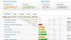
Page speed is everything. If your landing page loads slow, then it’s not even worth trying to promote. You need to make sure your page is fully optimised for loading times. It needs to be as “light” as it can possibly be. The tool we like to use to check our pages is: GTmetrix
Your visitors will have a very limited attention span, pair this with the potential for slow connection speeds depending on their scenario and you could be paying for traffic that never even has the opportunity to see your page.

Responsiveness
I don’t care if you’re just throwing desktop traffic at a page, and neither should you. Somewhere along the line, someone is going to be viewing it on a tablet or device. Hands down one of the MOST important factors of your landing page is how responsive it is. It’s also important to make sure you’re responsive layout is correct. Always place your forms and call-to-actions above the fold on mobiles and tablets. The best way to check this is by viewing it on your devices, but you can also check on: Responsinator / Chrome Inspector

Cross Browser Compatibility
So the landing page may look great on your browser, but have you tried it on other browsers? Other versions of browsers, etc.? You may be losing a large amount of your conversions if your landing page isn’t optimised for ALL browsers, and most importantly ALL browser versions. You’d be amazed at how many people of the older generation still use an ancient version of that god awful thing called Internet Explorer. Be sure your page is set up to view correctly on all browsers, and doesn’t have any bugs or conflicts that stop it functioning to get the most out of your traffic. You can check your browser compatibility here: BrowserStack

W3C Validation
If you’re not aware, W3C validation is the worldwide web’s standard of code. Basically, it’s the law when it comes to coding your landing page. Not being W3C compliant doesn’t mean your page won’t display correctly, but it can bring complications. In a world where it’s my page against yours, I’m in a better position if my W3C code is validated as best as it can be. The quality of your code will have an effect on different browsers and the way people view your landing page. Clean up your code and check for errors here: W3C Validator

Form Validation
Another type of validation – one that’s super important yet you’d be amazed at how many pages I get sent without it – is form validation. If you’re getting paid for a specific type of lead or form submission, then you want to make sure that form is 100% valid. Not only will this help you filter out useless leads, but will help keep you and your buyers happy with higher quality, filtered prospects. Make sure you install the standard form validation, and also you may want to look into form lookup services. Basically, this stops people from entering incorrect or dummy data or skipping fields on your form. At the Landing Page Guys we work on custom validation but there are some free, effective alternatives available. Check out some basic form validation code here: Parsleyjs and some decent lookup services here: Xverify

Form Positioning
ALWAYS ABOVE THE FOLD! Again, you’d be amazed at how many clients send me their old landing pages and ask why they’re not converting. Then, I see their form somewhere merged at the bottom of the page after about 6 hours of scrolling. If your form submission is the most important thing, give it to the user straight and put it above the fold where they don’t even need to use their lazy index finger to scroll to it! Yes – by all means – include another form elsewhere, but put it ABOVE THE FOLD! Got it? Ok…

Form Visibility
If you’re using a form on your landing page, then you need to clearly accent it and establish it from the rest of your page. A few ways we like to do this is to make the form a completely contrasting colour from the rest of the page. Also, we normally use a large arrow pointing the user exactly to that very form we need them to fill out. You have to make it SO simple for them. Another nice tip is to add a small stroke or border/shadow to your forms to make them “pop” slightly more.

Call to Action
You MUST always have a strong call to action. Whether it’s to “buy now”, “book an appointment”, or whatever your page may be selling, you have to have that call to action above the fold. There’s no use whatsoever in making your user scroll halfway down the page or to the bottom to action something. They will more than likely just get bored and leave. Always have a STRONG call to action, and by that I mean, outline what it is you want your visitor to do and make it so clear in whatever form it may be that they can’t miss it!

This was originally posted on my blog but I though it would help some of the members here so I hope it's ok sharing this. You can find the original article in full here: 16 Landing Page Tips You MUST Be Using! | Oliver Kenyon | Young Entrepreneur
-------------------------------------------------------------------------------------------
16 Landing Page Tips You MUST Be Using!
I’ve now been running my design and development company for 3 years and cofounded Landing Page Guys around 2 years ago.
Since starting the company, my partner Andy Haskins and I have grown an extensive team of the best designers and developers in the world in our chosen market.
Our team have created thousands of landing pages, and in order to sell these to our clients, I have to be an expert in my field.
I’ve studied every single page we’ve ever created, working closely with our lead clients to monitor their performance, and by doing so have managed to build a real “formula” and “checklist” of standards that every single one of our pages must meet.
Of course you have some pages that don’t convert as well, but the majority of our landing pages convert at a VERY high rate, and it’s in large down to our fantastic team that follows the checklist I’m about to reveal.
This very checklist is the reason we sell thousands of unique landing pages each and every year, turn over hundreds of thousands of pounds, and most importantly generate our clients MILLIONS upon MILLIONS of dollars!
Do NOT underestimate how important each and every one of these points are:
Page Speed
Page speed is everything. If your landing page loads slow, then it’s not even worth trying to promote. You need to make sure your page is fully optimised for loading times. It needs to be as “light” as it can possibly be. The tool we like to use to check our pages is: GTmetrix
Your visitors will have a very limited attention span, pair this with the potential for slow connection speeds depending on their scenario and you could be paying for traffic that never even has the opportunity to see your page.
Responsiveness
I don’t care if you’re just throwing desktop traffic at a page, and neither should you. Somewhere along the line, someone is going to be viewing it on a tablet or device. Hands down one of the MOST important factors of your landing page is how responsive it is. It’s also important to make sure you’re responsive layout is correct. Always place your forms and call-to-actions above the fold on mobiles and tablets. The best way to check this is by viewing it on your devices, but you can also check on: Responsinator / Chrome Inspector
Cross Browser Compatibility
So the landing page may look great on your browser, but have you tried it on other browsers? Other versions of browsers, etc.? You may be losing a large amount of your conversions if your landing page isn’t optimised for ALL browsers, and most importantly ALL browser versions. You’d be amazed at how many people of the older generation still use an ancient version of that god awful thing called Internet Explorer. Be sure your page is set up to view correctly on all browsers, and doesn’t have any bugs or conflicts that stop it functioning to get the most out of your traffic. You can check your browser compatibility here: BrowserStack
W3C Validation
If you’re not aware, W3C validation is the worldwide web’s standard of code. Basically, it’s the law when it comes to coding your landing page. Not being W3C compliant doesn’t mean your page won’t display correctly, but it can bring complications. In a world where it’s my page against yours, I’m in a better position if my W3C code is validated as best as it can be. The quality of your code will have an effect on different browsers and the way people view your landing page. Clean up your code and check for errors here: W3C Validator
Form Validation
Another type of validation – one that’s super important yet you’d be amazed at how many pages I get sent without it – is form validation. If you’re getting paid for a specific type of lead or form submission, then you want to make sure that form is 100% valid. Not only will this help you filter out useless leads, but will help keep you and your buyers happy with higher quality, filtered prospects. Make sure you install the standard form validation, and also you may want to look into form lookup services. Basically, this stops people from entering incorrect or dummy data or skipping fields on your form. At the Landing Page Guys we work on custom validation but there are some free, effective alternatives available. Check out some basic form validation code here: Parsleyjs and some decent lookup services here: Xverify
Form Positioning
ALWAYS ABOVE THE FOLD! Again, you’d be amazed at how many clients send me their old landing pages and ask why they’re not converting. Then, I see their form somewhere merged at the bottom of the page after about 6 hours of scrolling. If your form submission is the most important thing, give it to the user straight and put it above the fold where they don’t even need to use their lazy index finger to scroll to it! Yes – by all means – include another form elsewhere, but put it ABOVE THE FOLD! Got it? Ok…
Form Visibility
If you’re using a form on your landing page, then you need to clearly accent it and establish it from the rest of your page. A few ways we like to do this is to make the form a completely contrasting colour from the rest of the page. Also, we normally use a large arrow pointing the user exactly to that very form we need them to fill out. You have to make it SO simple for them. Another nice tip is to add a small stroke or border/shadow to your forms to make them “pop” slightly more.
Call to Action
You MUST always have a strong call to action. Whether it’s to “buy now”, “book an appointment”, or whatever your page may be selling, you have to have that call to action above the fold. There’s no use whatsoever in making your user scroll halfway down the page or to the bottom to action something. They will more than likely just get bored and leave. Always have a STRONG call to action, and by that I mean, outline what it is you want your visitor to do and make it so clear in whatever form it may be that they can’t miss it!


")