

Push notifications are gaining popularity, and it's not surprising given their impressive statistics. With a 90% open rate and an average click-through rate (CTR) of 4.6%, they've become a go-to for many marketers. However, users make quick decisions, evaluating an ad in just 3 seconds before deciding to engage or close the push notification. This makes it important to know how to capture your audience's attention with a short notification containing just a few dozen characters.
Today, we're tapping into the knowledge of MyBid's in-house media buying team to find out how the top affiliates manage to create push notifications that perform exceptionally well. We'll also be sharing some useful tips for other affiliate marketers based on their expertise.
Each element has its own nuances that will help you use it most effectively. Now let's look at each of them in more detail.
If there are people in the ad's pictures, it's important to pick photos that feel real and vibrant. Stock photos often seem overused and generic, which can make people react negatively. The best choice is to go for authentic images.
Numbers and statistics: Adding specific numbers and statistics to your title not only makes it more trustworthy but also grabs people's interest. For instance, if you mention how quickly something can happen or the exact benefits of a product, it tends to get more attention. Research proves that when you share clear numbers right from the start, you're likely to get higher click-through rates and conversion rates.
Emoji: Adding emojis to push notification titles can actually boost performance by up to 40%. These little symbols trigger emotional responses, making readers more likely to engage. Commonly used emojis include smiley faces, celebratory cues like champagne and confetti, and symbols like dollar signs and warning triangles.
Clear CTA: Clear calls-to-action tell the reader exactly what to do next, using action-driving verb phrases like "Subscribe Now", "Download the App", "Register to Win", "Get Your Free Sample" etc. Affiliates should determine their desired next step and convey that clearly.
Triggers: Triggers refer to emotionally-charged words that indicate benefits, like "Sale!", "Limited time offer", "Exclusive deals", "Free gift", "VIP access", and so on. These build anticipation and excitement.
Statistics from MyBid show that mobile users are 3 times more likely to click on push notifications versus desktop users. Therefore, titles need to be short, restricted to roughly 20 characters maximum, in order to display fully across all devices. The proven rule is that shorter headlines ultimately achieve higher open and click-through rates.
Sometimes, instead of putting emojis in the main headline, affiliates get creative and use them in this offer text. It helps them keep important things like the call-to-action (CTA) in the main title while using emojis here to make things more interesting and get people involved.
Also, it's noticed that personalized push notifications work better. Even simple touches, like putting the reader's city in the message, can make a difference. For instance, saying something like, "Here's a fantastic deal only for folks in {CITY}!" adds a personal touch and grabs more attention.
For example, ads for dating offers often use icons with a heart, a guy and a girl outline, holding hands, and so on. If it's about finance, the notifications might use symbols like dollar signs, coins, or bank symbols. Using images that make sense helps users quickly get what the notification is about and catches their attention.
Some affiliates neglect the importance of icons altogether. But on slower network connections, the icon loads first before the primary image. So if the preloaded icon seems irrelevant or confusing, users will often abandon the notification before the main image even appears.
A lot of media buyers overlook this, but the account managers at fully managed ad networks, such as MyBid, have access to libraries filled with icons related to every niche. They can easily share these icons with all their affiliates. This makes it a whole lot easier for affiliates to choose the right graphics, as opposed to going through the hassle of searching for them on their own.
People quickly decide whether a notification is worth their time. They instinctively think, "What do I get out of this?" If your headline doesn't clearly communicate tangible benefits that interest them, most people will just move on without bothering to learn more. Affiliates need to clearly mention advantages that address the specific problems or needs of the people they're trying to reach.
A much smarter approach for affiliate marketers is to use AI tools that can create realistic pictures of models whenever they're needed. With these new tools, marketers can quickly come up with lots of different photos featuring men and women, each with their own unique looks, backgrounds, and more. Testing has shown that these kinds of images, with all their special details, work best for getting the attention of specific audiences.
Affiliates see much better results when they focus on one clear instruction. Whether that's prompting people to check out the website, download an app, watch a demo video, or share their email, sticking to one straightforward path avoids distraction and keeps things clear. If the advertiser's main goal isn't immediately apparent, response rates will suffer. To avoid any uncertainty, make it crystal clear what you want the viewer to do next.
All titles should contain verbs outlining desired actions to provide clarity around intentions. "Register Now", "Claim Your Offer", "See More" and similar statements can increase the likelihood of user interaction.
Too much text: Reading lots of text on small screens is a pain. If the push notifications have too many words, people just ignore them. Affiliates should share value in a quick, easy-to-scan style. Use short and catchy phrases to highlight the most important selling points and benefits. Add some space, breaks, and even emojis to make the text more user-friendly.
Using other people’s ad creatives: The internet is full of spy tools and ad libraries where affiliates can find push notification ads that other affiliates created before. However, copying these ads without improving them or adding your own creativity can lead you down a tricky path. The problem is that these existing creatives have often been seen too much and have become worn out.
Mindlessly reusing old ad creatives that don't connect with today's audiences can quickly sink your campaigns and eat away at your ad budget. Affiliates are better off coming up with unique ideas that match their brand and what their audience cares about.
Even if you're just starting out, you can try out different push notification formats without burning a hole in your pocket. However, it's important to ensure that your ad creatives meet specific criteria before launching a campaign. We often come across ads with fantastic messaging but less-than-ideal technical dimensions. This oversight can lead to unnecessary expenses and a decrease in visibility, traffic, and conversions.
To steer clear of such issues, stick to the standard dimensions for web push notifications and In-Page Push formats:
Today, we're tapping into the knowledge of MyBid's in-house media buying team to find out how the top affiliates manage to create push notifications that perform exceptionally well. We'll also be sharing some useful tips for other affiliate marketers based on their expertise.
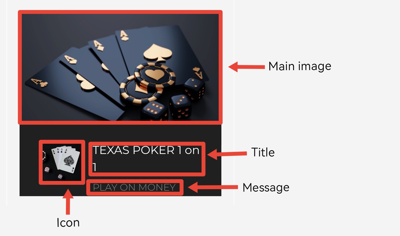
What does a push notification consist of?
There are four components to this advertising format:- Title
- Offer text
- Main image
- Icon
Each element has its own nuances that will help you use it most effectively. Now let's look at each of them in more detail.
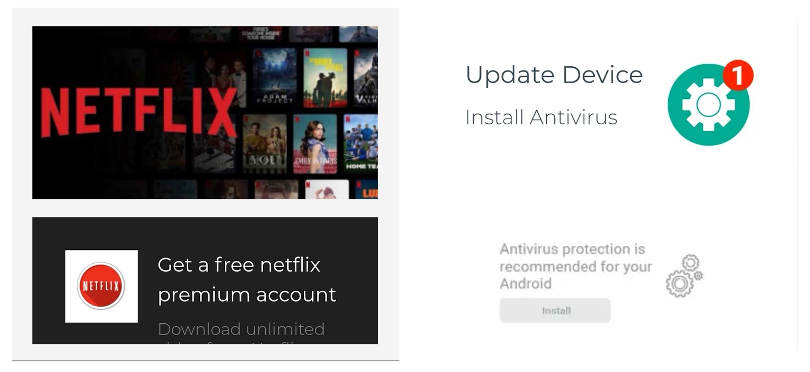
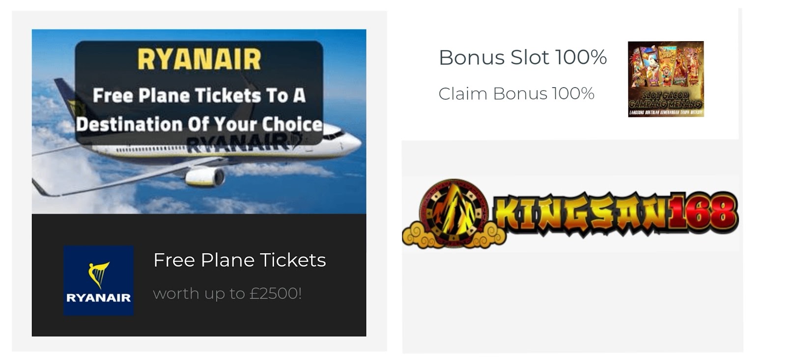
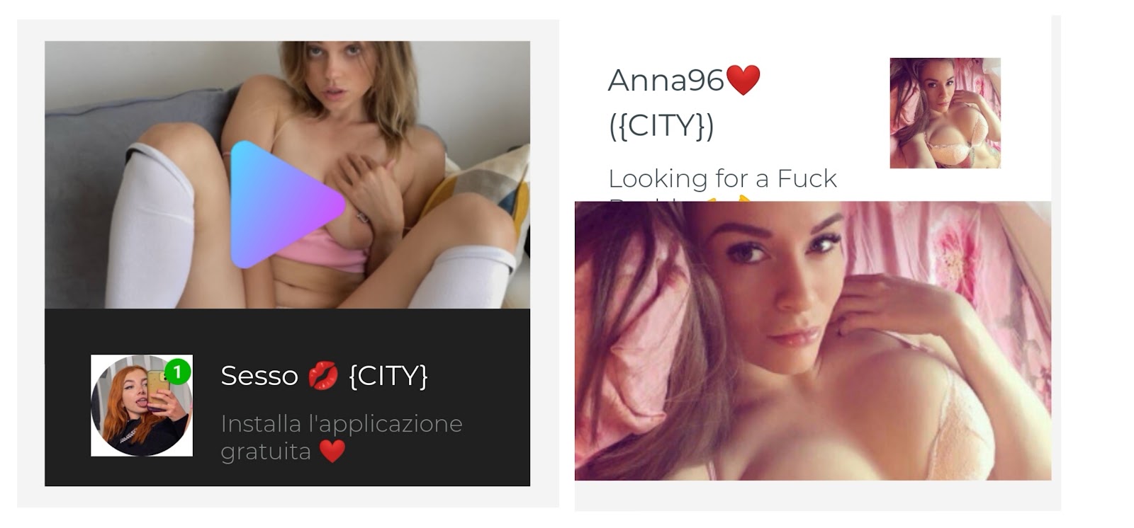
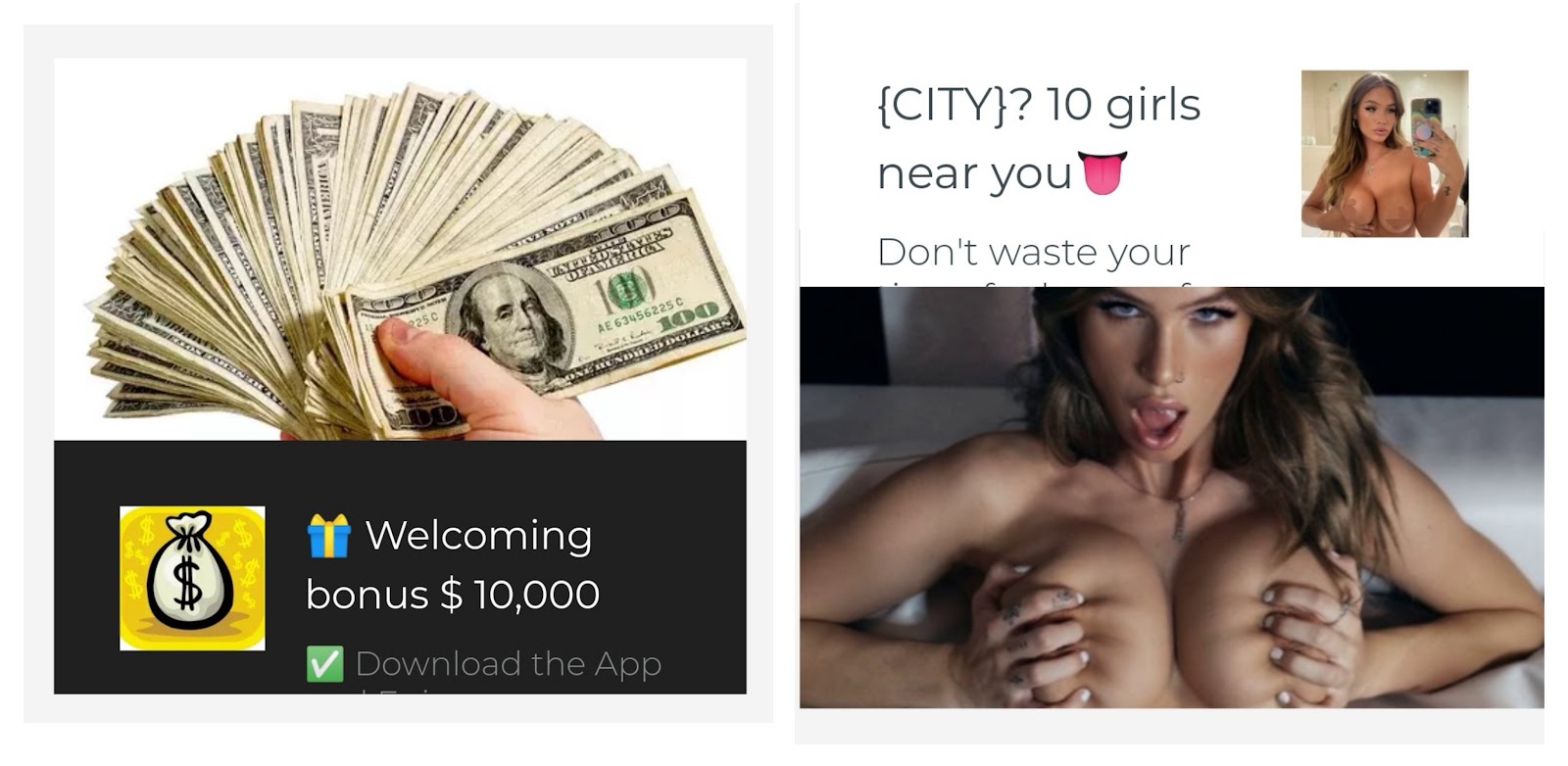
Main image
This is the part that grabs users' attention first when they see a push notification. That's why experienced affiliate marketers choose really good pictures for the main image. Usually, they make sure the picture file isn't too big—around 1 MB or less. If the main image is too large and takes too much time to load, the potential lead might just close the notification without even looking at the whole picture.If there are people in the ad's pictures, it's important to pick photos that feel real and vibrant. Stock photos often seem overused and generic, which can make people react negatively. The best choice is to go for authentic images.
Heading
The title in a push notification can only be 40 characters, and you get a total of 80 characters for the whole message. Since space is tight, smart affiliate marketers try to make the most of every character in the title. They use tricks like adding numbers, stats, emojis, calls-to-action (CTAs), and emotional triggers to make their messages stand out.Numbers and statistics: Adding specific numbers and statistics to your title not only makes it more trustworthy but also grabs people's interest. For instance, if you mention how quickly something can happen or the exact benefits of a product, it tends to get more attention. Research proves that when you share clear numbers right from the start, you're likely to get higher click-through rates and conversion rates.
Emoji: Adding emojis to push notification titles can actually boost performance by up to 40%. These little symbols trigger emotional responses, making readers more likely to engage. Commonly used emojis include smiley faces, celebratory cues like champagne and confetti, and symbols like dollar signs and warning triangles.
Clear CTA: Clear calls-to-action tell the reader exactly what to do next, using action-driving verb phrases like "Subscribe Now", "Download the App", "Register to Win", "Get Your Free Sample" etc. Affiliates should determine their desired next step and convey that clearly.
Triggers: Triggers refer to emotionally-charged words that indicate benefits, like "Sale!", "Limited time offer", "Exclusive deals", "Free gift", "VIP access", and so on. These build anticipation and excitement.
Statistics from MyBid show that mobile users are 3 times more likely to click on push notifications versus desktop users. Therefore, titles need to be short, restricted to roughly 20 characters maximum, in order to display fully across all devices. The proven rule is that shorter headlines ultimately achieve higher open and click-through rates.
Offer text
The offer text field is like a follow-up to the headline you just read, giving you an extra 40 characters to add more information. Usually, people use this part to back up and emphasize what they said in the main title.Sometimes, instead of putting emojis in the main headline, affiliates get creative and use them in this offer text. It helps them keep important things like the call-to-action (CTA) in the main title while using emojis here to make things more interesting and get people involved.
Also, it's noticed that personalized push notifications work better. Even simple touches, like putting the reader's city in the message, can make a difference. For instance, saying something like, "Here's a fantastic deal only for folks in {CITY}!" adds a personal touch and grabs more attention.
Icon
On phone screens, the pictures in push notifications are often too small to see all the little details. So, instead of using complicated images, affiliates choose simple icons that connect with the offer and quickly tell the message.For example, ads for dating offers often use icons with a heart, a guy and a girl outline, holding hands, and so on. If it's about finance, the notifications might use symbols like dollar signs, coins, or bank symbols. Using images that make sense helps users quickly get what the notification is about and catches their attention.
Some affiliates neglect the importance of icons altogether. But on slower network connections, the icon loads first before the primary image. So if the preloaded icon seems irrelevant or confusing, users will often abandon the notification before the main image even appears.
A lot of media buyers overlook this, but the account managers at fully managed ad networks, such as MyBid, have access to libraries filled with icons related to every niche. They can easily share these icons with all their affiliates. This makes it a whole lot easier for affiliates to choose the right graphics, as opposed to going through the hassle of searching for them on their own.
Three Tips to Increase Push Notification Click-Through Rates
We have identified three key rules that affiliates should follow in order to boost push notification performance:- Offer value:
People quickly decide whether a notification is worth their time. They instinctively think, "What do I get out of this?" If your headline doesn't clearly communicate tangible benefits that interest them, most people will just move on without bothering to learn more. Affiliates need to clearly mention advantages that address the specific problems or needs of the people they're trying to reach.
- Avoid using stock photos
A much smarter approach for affiliate marketers is to use AI tools that can create realistic pictures of models whenever they're needed. With these new tools, marketers can quickly come up with lots of different photos featuring men and women, each with their own unique looks, backgrounds, and more. Testing has shown that these kinds of images, with all their special details, work best for getting the attention of specific audiences.
- One offer – one call to action
Affiliates see much better results when they focus on one clear instruction. Whether that's prompting people to check out the website, download an app, watch a demo video, or share their email, sticking to one straightforward path avoids distraction and keeps things clear. If the advertiser's main goal isn't immediately apparent, response rates will suffer. To avoid any uncertainty, make it crystal clear what you want the viewer to do next.
Common Push Notification Mistakes to Avoid
No CTA: Neglecting to explicitly include a clear call-to-action is a quick ticket to poor click-through and conversion rates. Without directive language outlining the next intended step, users have no sense of what is expected of them. This leaves them confused and likely to ignore your push notification out of frustration.All titles should contain verbs outlining desired actions to provide clarity around intentions. "Register Now", "Claim Your Offer", "See More" and similar statements can increase the likelihood of user interaction.
Too much text: Reading lots of text on small screens is a pain. If the push notifications have too many words, people just ignore them. Affiliates should share value in a quick, easy-to-scan style. Use short and catchy phrases to highlight the most important selling points and benefits. Add some space, breaks, and even emojis to make the text more user-friendly.
Using other people’s ad creatives: The internet is full of spy tools and ad libraries where affiliates can find push notification ads that other affiliates created before. However, copying these ads without improving them or adding your own creativity can lead you down a tricky path. The problem is that these existing creatives have often been seen too much and have become worn out.
Mindlessly reusing old ad creatives that don't connect with today's audiences can quickly sink your campaigns and eat away at your ad budget. Affiliates are better off coming up with unique ideas that match their brand and what their audience cares about.
Conclusion
The good news is push advertising carries little financial risk for affiliates, thanks to the cost-per-click (CPC) model. With this approach, you only pay when users click on your ads. Push notification CPC rates, especially on platforms like MyBid, are surprisingly low, starting at just $0.000169 in top-tier geos.Even if you're just starting out, you can try out different push notification formats without burning a hole in your pocket. However, it's important to ensure that your ad creatives meet specific criteria before launching a campaign. We often come across ads with fantastic messaging but less-than-ideal technical dimensions. This oversight can lead to unnecessary expenses and a decrease in visibility, traffic, and conversions.
To steer clear of such issues, stick to the standard dimensions for web push notifications and In-Page Push formats:
- Icon: 192x192 pixels, JPG, or PNG file
- Main Image: 720x480 pixels (or 360x240 for square sizing), JPG, or PNG file